Decider
research, Visual design, ux/ui, design system
In 2014, Decider launched as the first entertainment and pop culture destination site to help today’s on-demand generation discover the best streaming content. What began as an idea to help diversify our network and gain both new users and partnerships, became the hub for the perfect blend of informational, yet hilariously fun insight and a unique experience for on-demand users.
I had the pleasure of working with Creative Director, Jan-Jan Tayson to design the visual brand and website experience from ideation to execution.

Project:
TIMELINE:
April 2014 ➝ May 2015
ROLE:
Art Director, Visual + UX Designer
Skills:
UX/UI, Website Design, Research, Branding, Product Design, Design System, Wireframing, Prototyping
Phase 1
║the Challenge║
Create a customized streaming experience to reach new unique users
In a world full of streaming options, our challenge was to create a different experience that would reach new users and make streaming entertainment content less overwhelming, unique and even more enjoyable.
║research║
Goals
When conducting our research, the digital design team and I really wanted to empathize with our users. We wanted areas of the highest engagement and traffic to guide us into the next addition to the New York Post Digital Network. To begin, we organized the limited traffic and survey data we had and established the following research goals:

Insights

Our results concluded that many of our best performing content and most viewed articles were about streaming platforms, specifically Netflix. Through this we saw an opportunity to reach a new unique audience, the on-demand generation. Streaming platforms have fundamentally changed the way we consume and think about television, movies and digital entertainment. How can we capitalize on this?
║ideation║
Wireframes and Moodboards
Based on our insights, we created sketches and low-fidelity wireframes to present to our team and stakeholders. In our iterations, we wanted to focus on giving users the highest in-demand content first, then guiding them through curated lists of new and recommended shows. Once confident in the layout and flow, I began to create moodboards to establish the visual identity for the Decider website.

moodboards ➝

║visual design solution║
Final Designs
Below are the final designs I created for the Decider website. Playful visual cues were created through the use of bold shapes and colors. With new features such as the “Mood Emojis” filter where users can find new shows and movies based on their current mood, or the “Ultimate Guides” list to streaming, we were able to achieve our goal of creating a unique customized space for streaming entertainment to a new generation of users.

║specs║
Deliverables
To prepare for development, I created the dev paddings and exported all necessary assets. These included design mocks, header images and svg assets such as arrows, icons and the Decider diagonal pattern.
Paddings ➝

design system ➝
With each new launch, the digital design team and I work to develop a concise, scalable design system. We created boards to identify all styles, components, widgets etc. used throughout Decider and worked with copywriters to make sure the language would be easily understood by all teams and stakeholders.

Phase 2
║ab testing║
After launch, the team and I analyzed the site performance post mortem and began to brainstorm other ways to enhance user engagement. Those discussions led to designs and AB tests created for new interactive features such as show polls and email sign ups.

║takeaways║
Impact:
At launch, page views reached 6.3M in 3 months
We received an overwhelming response to the galleries, which increased page views by a million
Decider was featured on several publications and promos for popular shows such as the Leah Remini Series Scientology and the Aftermath
Collaborate + Take Risks
Through working on Decider, I learned more about the ideation process along with the value in collaborating with teams to successfully engage with a new audience and make a product come to life. I also learned more about myself as a designer and how it is ok to think outside of the box and take more risks in your designs.
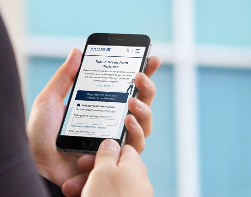
United for business: SeLF-eNROLLMENT
VISUAL DESIGN, UX, USER FLOWS, PROTOTYPING

Post Sports+
RESEARCH, VISUAL DESIGN, UX, USER FLOWS, PROTOTYPING

PAGE SIX STYLE
ART DIRECTION, VISUAL DESIGN, UX, DESIGN SYSTEM

NYPOST
video MEDIA
RESEARCH, VISUAL DESIGN, UX, ANIMATION

decider 2.0
VISUAL DESIGN, ANIMATION, UX/UI

united airlines: group request form
VISUAL DESIGN, UX, PROTOTYPING

DECIDER
RESEARCH, VISUAL DESIGN, UX, DESIGN SYSTEM

BED BATH & BEYOND
SHOP-ALONG USABILITY TESTING
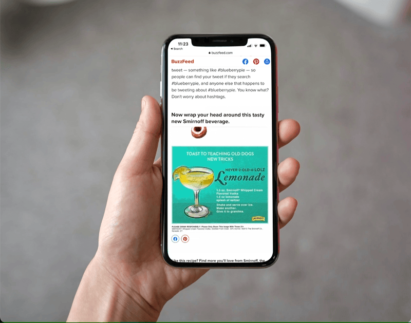
smirnoff/Buzzfeed
VISUAL DESIGN, ILLUSTRATION, ANIMATION

PARAMORE
VISUAL DESIGN, UX